Brackets #11

Screen Shot 2015-02-24 at 14.28.34 Screen Shot 2015-02-24 at 14.28.52

Today we was just fixing things on the PHP so it links up with the database nicely and will move smoothly. To do this I added in a few more if statements such as what will really happen when you sign into the database. Such as when you sign in it will you be asked for the username and password. then the database will try and find a match coming up with one result which will be your login. If this is incorrect then an error message will appear if it is successful then a welcome message is displayed. I also made it so when the welcome message come up it will also display your name. I did this by referring to the users username.

___________________________________________________________________________

References:

Goslan, K., 2015. Workshop. Available from: Bournemouth University [Accessed on the 24th February 2015]

Mocking up some Ideas

Screen Shot 2015-02-28 at 23.52.12

Just looking on the ideas we drew up yesterday, I thought I would take it onto the computer. This is just an image but i was wondering how it would look. So i quickly placed together, Unfortunately I didnt have photoshop so i just downloaded this program so i could see it more visual on the screen. so i added some key features such as the logo header of the page and navigation bar. Then This was the About page so i drawn it out how i though it may look. adding the circles like in the plan, Then a box if it was to pop it out of the name? maybe the circle grows bigger!? and/or changes colour? I also added a purple theme but something was missing. I know its just a mock but it looks too boring! need more going on in the page and to make it more interesting so  by next week hopefully we will have more information to what we are adding to the page and also maybe getting some of the code on the way.

HTML #3

Screen Shot 2015-02-19 at 12.16.54Screen Shot 2015-02-19 at 12.07.50 Screen Shot 2015-02-20 at 09.53.16

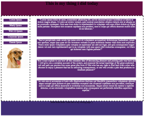
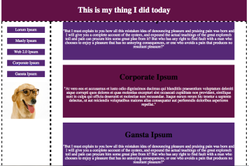
Todays lesson I worked on from last week! So I started by adding a text called Lorum Ipsum, Which is a text that is really random and is used to show where text would go on the page. This is useful as this means I dont need to put as much effort in when it come to text and thinking of paragraphs that I dont know what they will say yet! then at a later time i can change it to what I want to say. Then I moved on to adding borders to my content box and also the navigation bar. After this I started changing the layout of the boxes. I wanted the boxes to have a a space between them both so they stand out more. After this I had to change my whole colour scheme as it didnt go and needed to change. I went with purple as that is my fav colour. after this I worked on text. I had to change it to white so it was visible on the purple box. and I did this for both the content and nav. after this I saw My content box was bigger than it should be by a few pixels. Then I looked into why and I could see I have my border at 3px so it makes it bigger by 6px. To fix this I have to take the 6px from the content box so instead of 800px it is not 794px. After all of this I started changing random things for the sake of it. I started buy making the boxes change colour when they are hovered over, and also placing the text in the middle of the box it is contained in. Also added a header to each box so It links up to the nav bar. This was important so I can link them up. I wanted it so when you click on the name in the nav bar it links up to the text in the content I did this by adding links and <a> tags to the code. I also added an overflow in the content! this is so I can make the content box as big as I like and it adds a scrolling bar so it dont look out of place on my page. lastly I just needed to work out why I had the links and also the names repeated on the page in my nav bar but this was only due to repeated code that was unneeded, So i just deleted it. Then that concludes me today! I think I really have inproved from last week and am really enjoying HTML.

Screen Shot 2015-02-19 at 12.04.28 Screen Shot 2015-02-20 at 09.56.06

___________________________________________________________________________

References:

Wilkinson, P., 2015. Workshop. Available from: Bournemouth University [Accessed on the 20th March 2015]

Group Work First Ideas

FullSizeRender.jpg-2FullSizeRender.jpgFullSizeRender.jpg-1

So today my group all met up to see what we can do for a website thing of different ideas in which we can do and work on. In my group is Mark, Nibla, Luke and myself. We all placed ideas forward about what kind of websites we could do. A few ideas were a recipe website? Photo shearing website? Holiday home website and so on. After we went though all of the ideas we could think off we finally came to the conclusion of making a Job searching website for uni students. We liked this idea because it was original an different to what others were doing in our class.

We then had to think what was our about page going to look like. When we came to together we had lots of ideas flowing all over the table. We all agreed on not having a simple boring looking page and get our coding skills out for good use! So no normal squared containers containing photo name and who we are in! we started up drawing out some rough ideas to see what we can think off. So we started thinking we could all have an image in a circle where you can hover other out face and text will appear below about us. after this the ideas just kept expanding and we though a container could drop down from the image containing all the information it needed. till we came to the final Idea where we wanted to make use of the page space. So we thought to fill the page with an image and then the information will take place of that image.

Now we needed a name for our job website. We all took time to think of a good name for our page. It needed to relate to getting jobs and students, Something like the Bournemouth Uni one which is MyCareerHub. We went though so many different names like UniJobZone, iNeedMoney, UniiJobs and Student Jobs HQ. We had a long list of names and we all voted on the ones we liked the most and came to the conclusion on using Jobs4Students.

We now have a name and layout we now need a Colour Scheme! We all choose a combination of colours we though would look good on a webpage. We came to 3 sets of colours. Purple/Grey/Black, Red/Orange/White and Blue/White/Turquoise. We then all decided the Purple one was best but instead of Grey we would use white. So our Colour Scheme is Purple/White/Black.

Lastly for the day we had to think about the Font for the page. This has to be something nice to look at and read, and nothing too outrageous. It made me laugh how everyone in my group all said no to Comic Sans. I have a good Group here 🙂 We summed up the best text types where Arial, Helvetica and Verdana. When it comes to making the page and changing the font we will then test what font looks best on the page.

Before we all split up for the day and assigned everybody a job each for this project. with Mark doing HTML, Nibla doing PHP, Myself doing Designs and Luke doing Research. We all know we may not stick to this as we all will help out when the time arises. but for now a nice clear path is good to look at.

Very Last thing We all Agreed to make a GitHub Which i have finally done (oops) so now we can post and share all out work and all help one another when it comes to the coding and also know when people had added new information to the code.

HTML #2

Screen Shot 2015-02-12 at 12.24.40Screen Shot 2015-02-12 at 12.17.50

For todays lesson we was set a task to make a webpage with a container containing a header, navigation bar, body and footer, After adding these to the page I had to make them fit in the container correctly and sit nicely. When I fixed all the boxes I then made it so they would stay in the middle of the page no matter how much you change the size of the browser. After this I added in some text and an image. This then made my boxes go out of place. But after finding out the padding on the page is set to 16px, I then changed it to 0px so it would be normal again. So in the end I touched everything up to make it look okay and i completed the task.

Screen Shot 2015-02-12 at 12.33.17Screen Shot 2015-02-12 at 12.55.27

___________________________________________________________________________

References:

Wilkinson, P., 2015. Workshop. Available from: Bournemouth University [Accessed on the 12th March 2015]

Brackets #10

Screen Shot 2015-02-10 at 14.56.41

Today In the workshop I was mainly getting used to the database in which I will need to use later in the project. This database was ensuring me that when people log into it they will have to have a correct username, password which match up to their ID and also the date they joined. Todays lesson was more about how to get around the page and inputting the correct the information.

Screen Shot 2015-02-10 at 13.36.42

___________________________________________________________________________

References:

Goslan, K., 2015. Workshop. Available from: Bournemouth University [Accessed on the 10th February 2015]

HTML #1

Screen Shot 2015-02-05 at 12.30.21

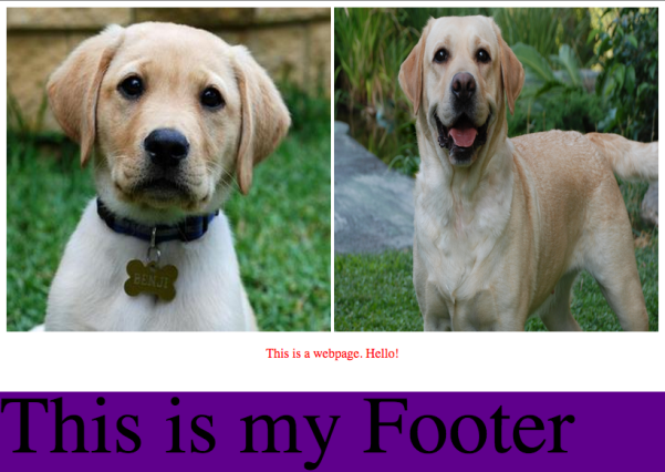
Back to HTML today, Just refreshing the mind and just testing a few Ideas. So got an image of a dog where I then had to make a size of 400 px by 400px, Then add text below and change its colour. After this a added anouther image also changing it size and making it go inline with the other photo. Then I had to make the images and text stay in the center of the page and so make it change depending on the size of the browser, Lastly I added the footer where I changed the colour and also made it stick to the bottom of the page. This concludes my work for the day till next week.

Screen Shot 2015-02-05 at 12.58.08

___________________________________________________________________________

References:

Wilkinson, P., 2015. Workshop. Available from: Bournemouth University [Accessed on the 5th February 2015]