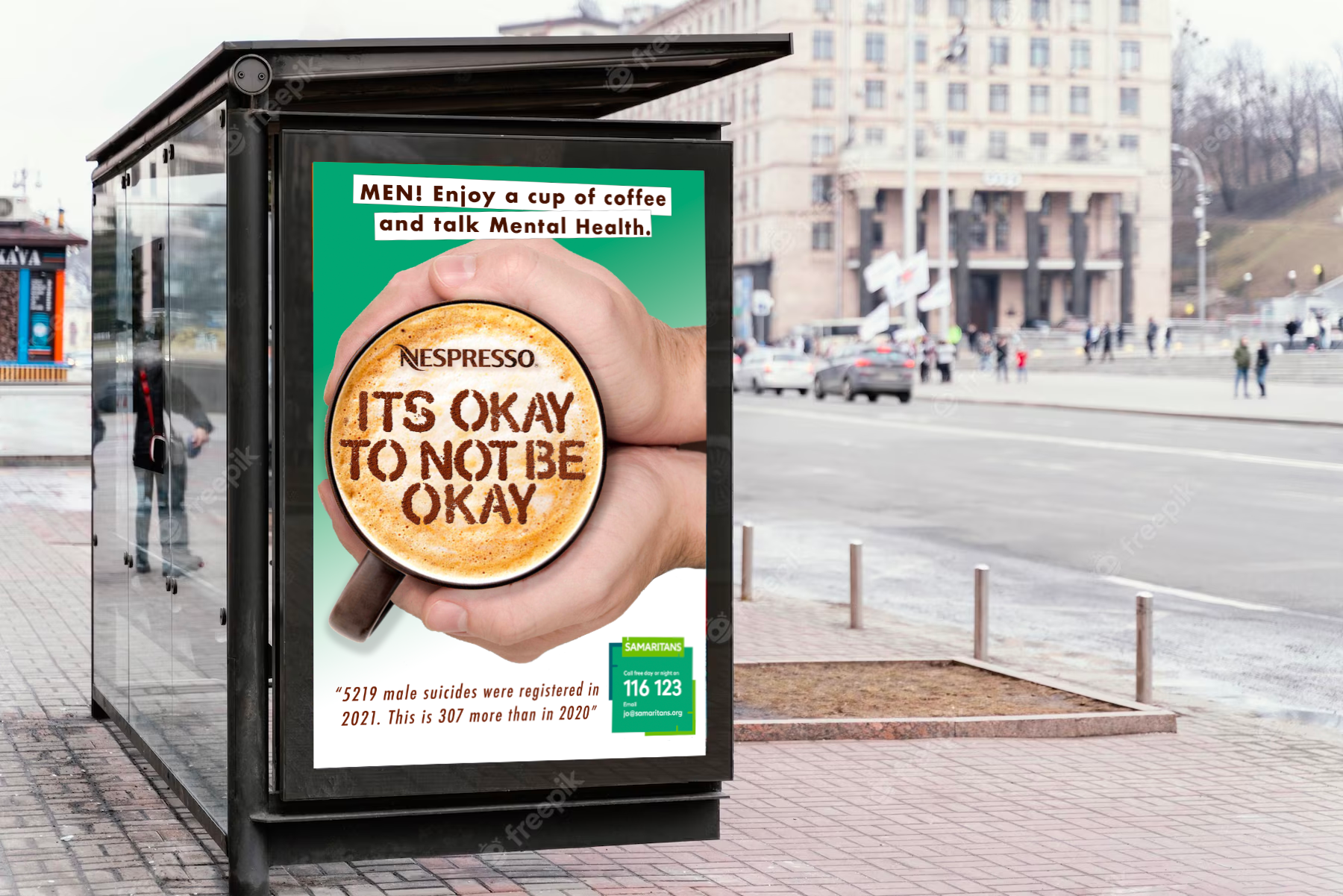
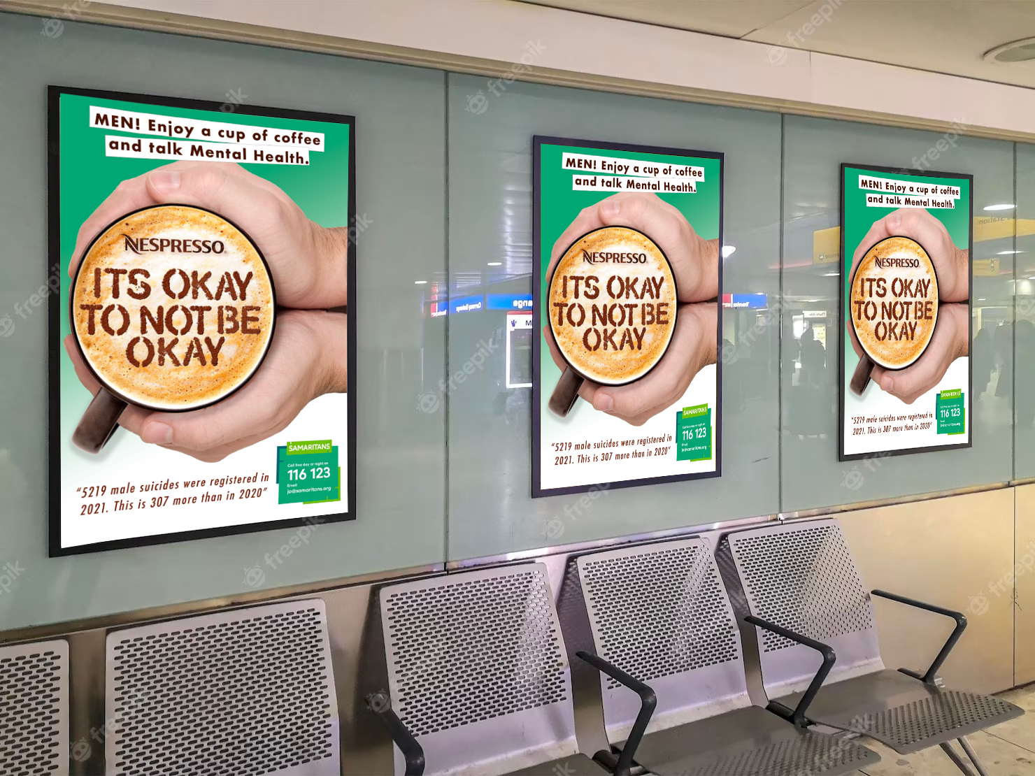
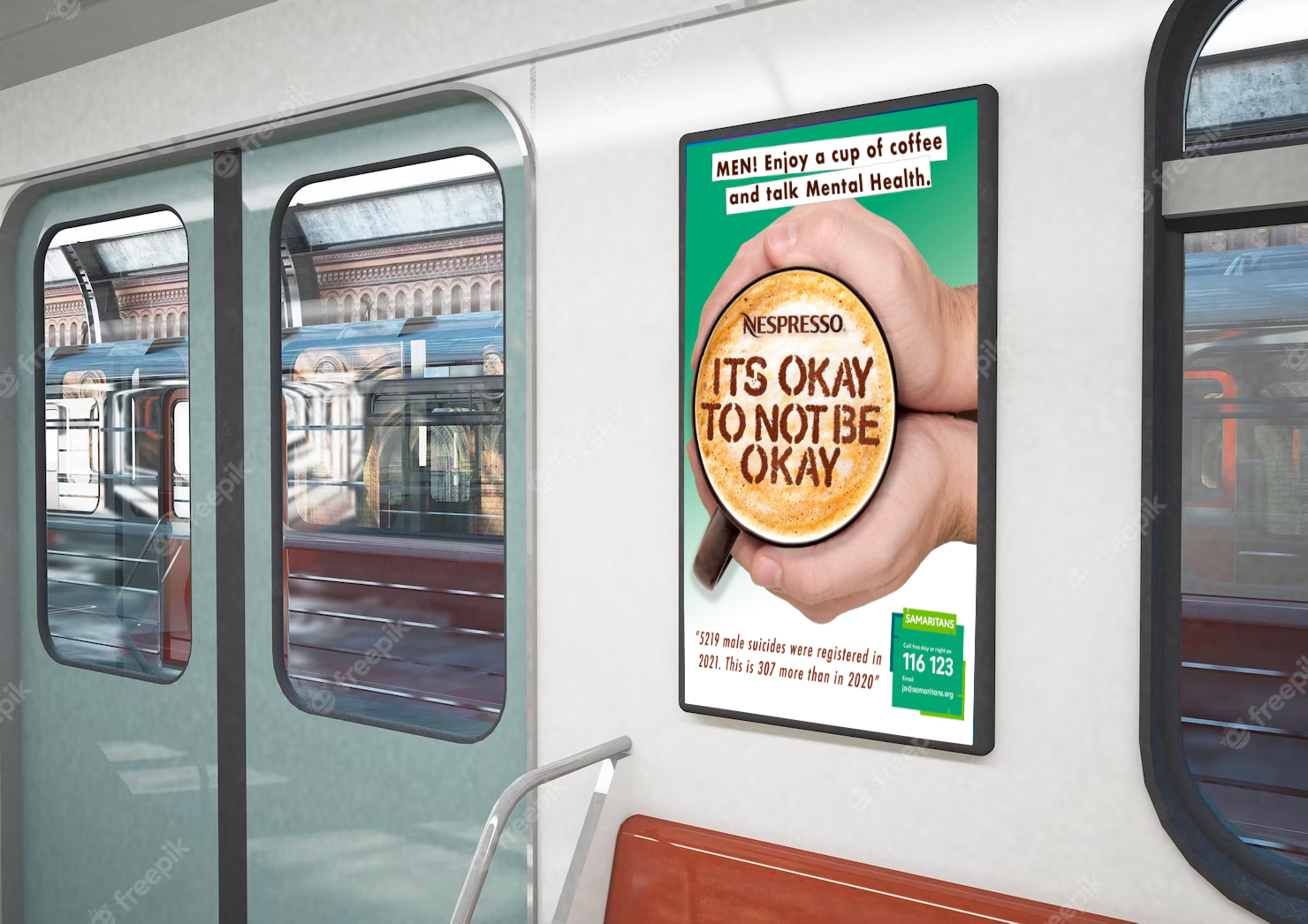
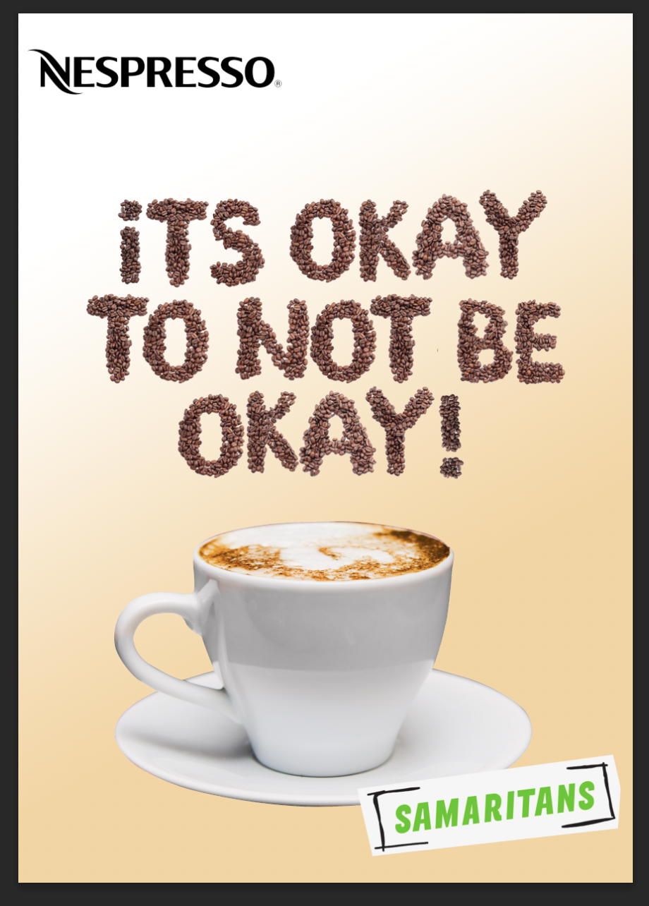
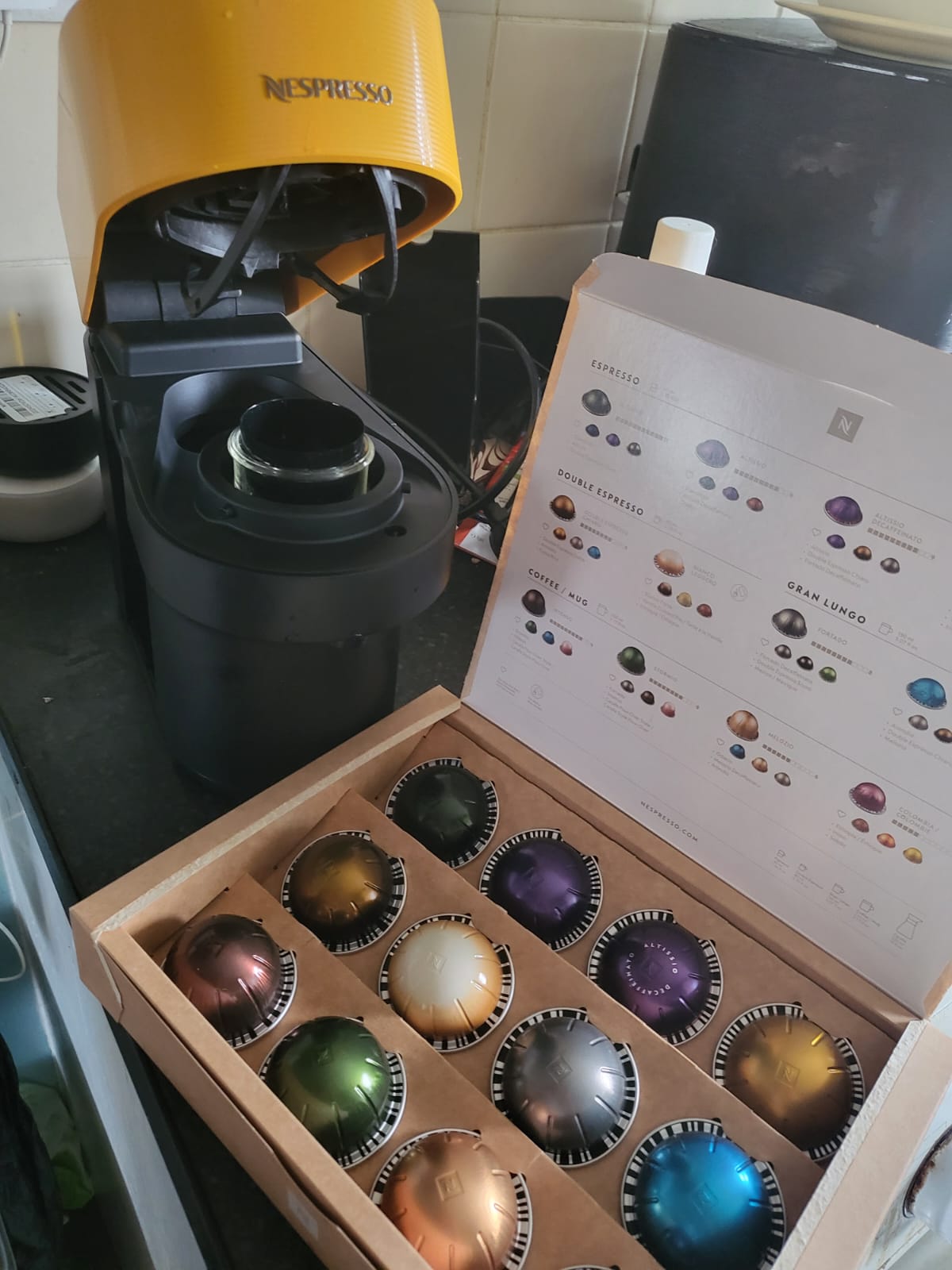
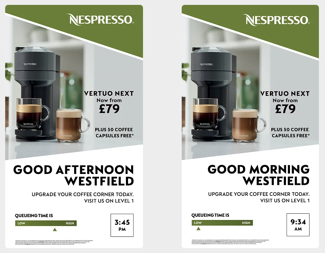
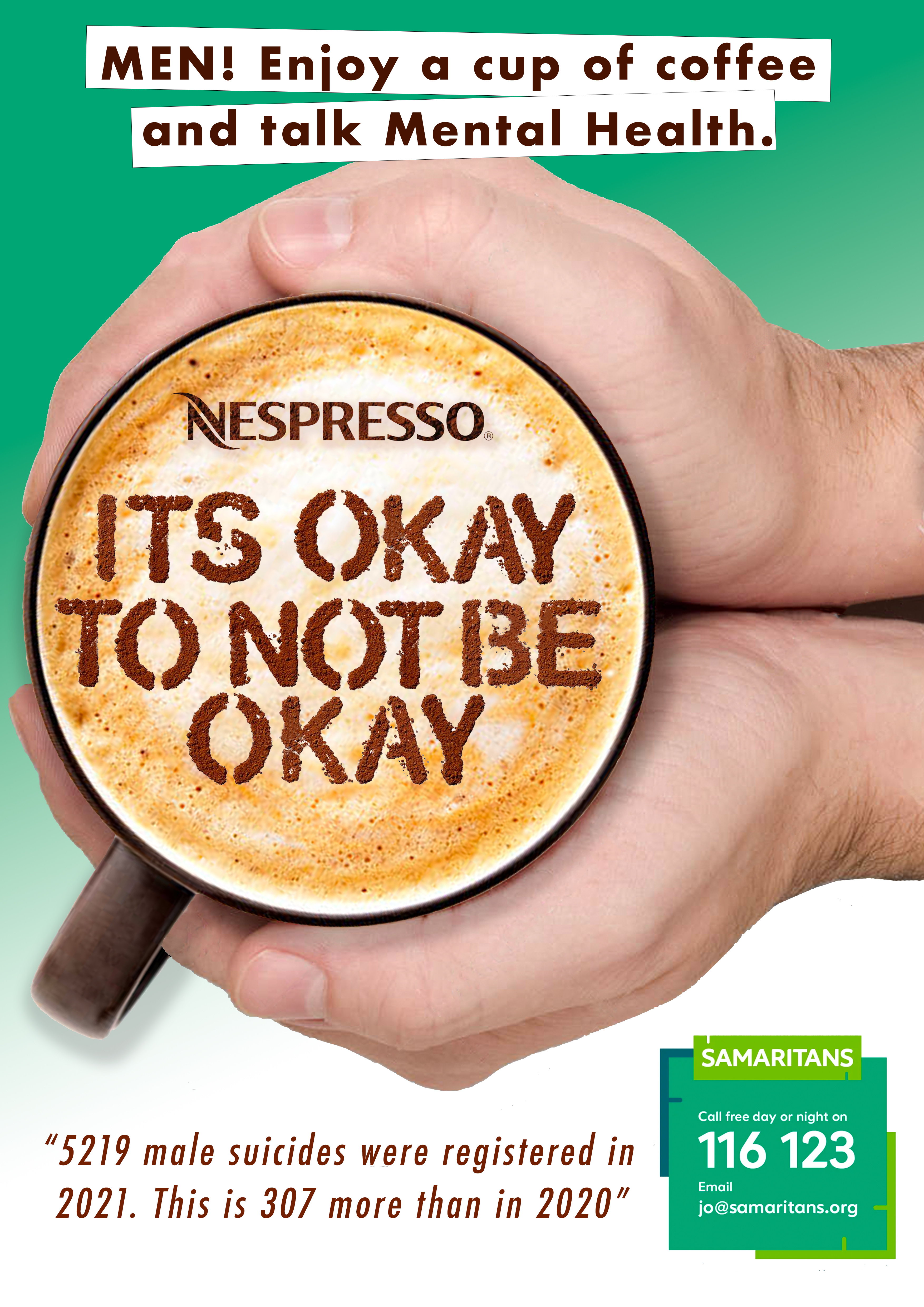
It’s okay not to be okay! This is my final design for my design bridge project looking into Nespresso and mental health for career-driven millennials. I have looked into the social design and applied it to my work, trying to get men to seek mental health support over a nice cup of coffee. This is because male millennials are the most likely to keep things bottled up. meaning they are the most likey people to commit suicide. I would place this campaign in train stations, bus stops, and the underground.

Making a poster to get male millennials to seek help when suicidal. I started using coffee beans to make the text but felt it was a bit small to see that they are coffee beans instead, I used cocoa powder and sprinkle it on top of a coffee. I liked this a lot more. I then played with the logo and the color in the background to match the Samaritans logo. I added a quote but in the top text, I was unsure what to do to get a man’s attention. Then I thought ill be direct and say what I wanted to achieve. I also added in some male hands to try and get a man’s attention. I change the green from the logo to the background of the logo to match a bit better. I added the Nespresso logo on the coffee and made it coco powder as well and made the quote nicer to read. overall I’m happy with my work and can’t wait for my next project.

Presentation Review

After I did my presentation to the class we got grades back with ways to improve my work. To start off with for my first piece of work most of my grades were D-B which I was happy with as I knew I forgot some of my work out. So reading my comments back I have a few to reflect on. A design problem is a main point you need to create a design for, mine would be for suicide awareness for men aged 25-40. I need to look into the graphic design around health and well-being. I was going to make the packaging of a Nespresso box but have come to the conclusion that it’s not the best way to spread awareness compared to poster collections or an advert, so I need to rethink my project. I have looked into what other Graphic Design campaigns are out there but need to keep looking into it. I need to look into a more contemporary design that is relevant to my work. Macmillian has already done a coffee morning and that’s like my idea of having coffee and a chat together. also Mind has done a campaign to make a conversation. But what are they missing and what do I need to do for my project. This has made me think and I have more ideas for my work but need to think about what my next steps are!

Making a 3D Box

We made a new Logo for my gin box then we used that logo pattern to make a new pattern for my box. However, I didn’t like the pattern I created. I then loaded up Dimension and started with a box. I then textured the box first with my pattern then I found the other textures like this copper look. I then added my logo and placed it where looked best. finally, I added a water splash to look like the gin inside the bottle.

Metallic/Lino Printing

This week we went to the studios to do some printing. First, we did Metallic printing where we had to print off a design and place a metallic colour on a black design and place it into a machine that heats up the ink, and the metallic colour sticks to the black. really good idea for making boxes. Then we moved on to Lino printing. I cut out my design loaded it up with black ink and placed it on paper and put it into the print press and these are the outcome.

Nespresso packaging

I’m starting to look at the packaging that Nespresso used. I see these long black boxes with colourful pods inside, From what I’ve learned I can add the metallic text on the box. I’m thinking also about changing how the pods look. This is interesting to see if I mimic the box or create my own. I then brought my own machine to check out how it works and who is the right target audience. my machine came with free pods which was nice but now i can see the come in different size pods which is interesting. I need to think about what packaging i will go with.

Nespresso has done a few campaigns such as working with Westfield and tracking the customers coming into the store so digital boards can display how long the queue is so customers come in when it’s slow. Also, they did an empty cup campaign to show the threat of climate change to coffee production. They used ambassador George Clooney saying ‘The stakes are high’ with an empty cup to think about what would happen if we had no coffee.

After Effects

Today in class we worked with After Effects making shapes and moving them around to make a little clip. we moved forward with this mountain scene. we moved the clouds and sun finally making it dark as the sun sets.

Making a Gin box

Here we started to use InDesign and make boxes for a gin bottle. I started with a drawing of sakura cherry blossom and drawn it on paper. It then was taken into InDesign and I just used one petal and repeated it 5 times, Then i worked out where it would be best on the box without taking too much away from the structure. After it was printed and glued together i added the flowers cutout on the top and a pink cherry blossom background to the cut out and it looked awesome. I love the Ripcord that was made.

First Project Mind Map

Here we need to make an on-brand response to an issue for a target audience. So I mind map a few ideas and go with what feels on the brand to the chosen brand. I thought through a few ideas of what I can do for the project. Such as a sponsored Run for Addidas or LGBQ+ colours for Adidas Trainers. But my favorite example is Nesspresso share a coffee with your child to support mental health. I will keep adding to this as the project goes on and hopefully an idea will stick and ill use it in my final work towards the project.